Case Study #1: Designing a scalable solution to power data-driven DEI
It’s not often that within your first month at a job, something you build is implemented immediately across the entire company, but that’s what happened to me at Collective. I was tasked with designing a way to analyze and report the large volume data collected by our DEI Culture Survey product. In my design, I had three primary objectives in mind:
it needs to help our consultants see both the big picture and the gaps across identity in our clients.
It needs to be easily understandable and accessible, even if you don’t have a lot of experience with data analysis
It needs to scale - this template should not require significant alteration from client-to-client, nor should it carry increase in cost to use.
See below for three selected artifacts from what I built. Please know that all numbers are randomly generated, and any similarity to the real world is entirely coincidental.
1.1 Executive Summary
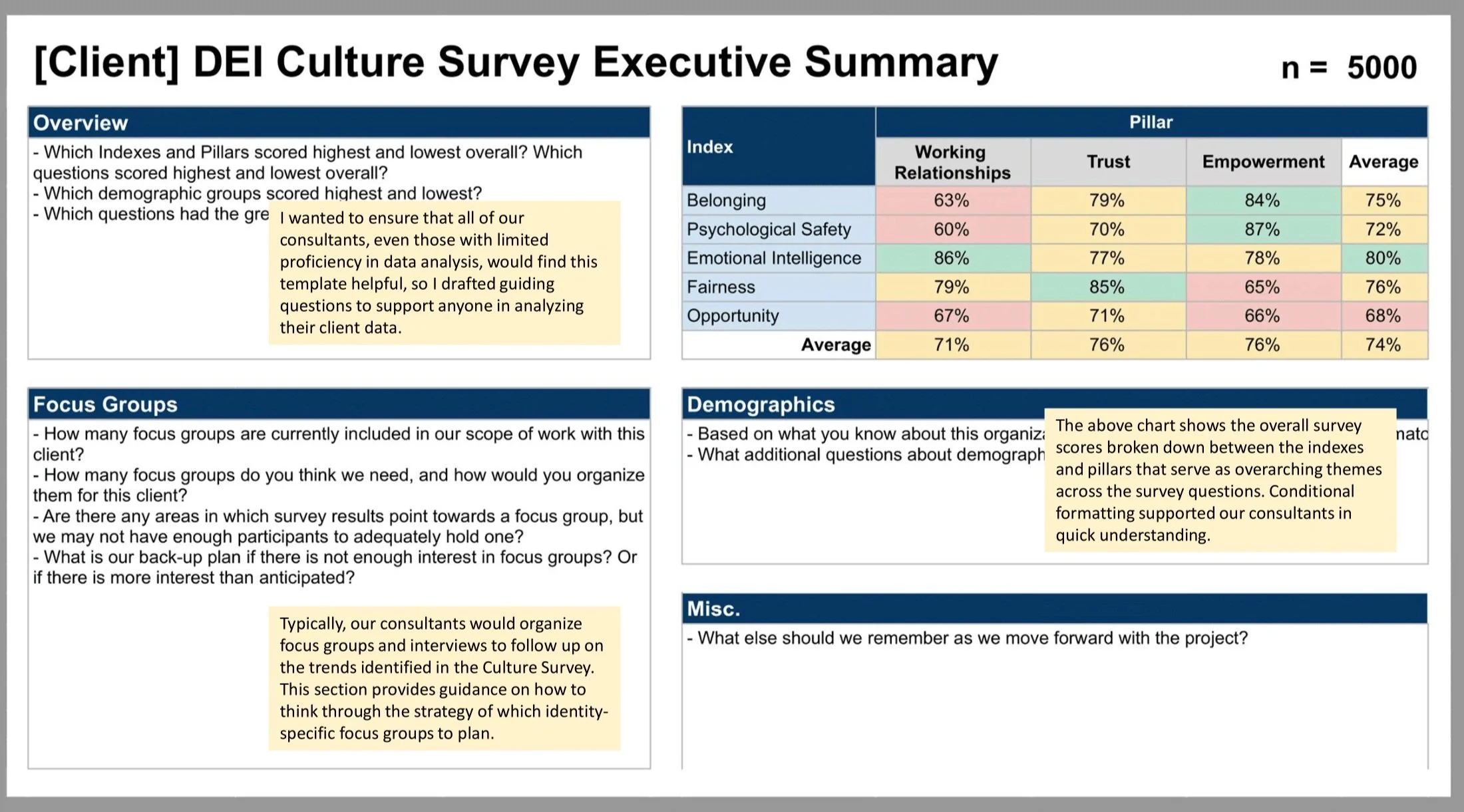
I chose to design this entire product in GoogleSheets in order to maintain our tech stack to keep costs low while also avoid having to introduce a new and unfamiliar platform for staff.
This executive summary was designed to allow our consultants an opportunity to summarize and consolidate their notes before going on to prepare client-facing decks and presentation. I incorporated conditional formatting and self-directed questions into the template to provide guidance to my colleagues in their analysis.
Click on the image to the left to see more details.
1.2 Demographics

Collective’s survey included nearly a dozen questions asking about participant demographics, and I wanted to ensure that our consulting teams could see them quickly at a glance along with average favorability scores for each community. This presents a quick overview of who makes up the client’s community, and what their experiences are.
Throughout this process, I relied on consistent and constant feedback from my colleagues to help inform my design choices. I needed to hear from them what did and didn’t feel intuitive, and how to separate the story from the noise.
Click on the image to the right to see more details.
The Core Report was the most robust source of information for our consulting teams, allowing them to see both favorability scores for each question as well as how different communities scored higher or lower. I made careful use of conditional formatting to allow the data itself to guide consultants on where to look to identify the most disparate experiences and relevant trends.
The full Core Report included this level of analysis for all demographic breakouts, but for the sake of brevity this example only shows race/ethnicity.
Click on the image to the left to see more details.

1.3 Core Report

Make it stand out.
INTRODUCE YOUR BRAND